Korean cushion foundations are sold by number: 13, 17, 21, 23, 25 and, increasingly, all the way to 55. The number tells you roughly how light or deep a shade is, but it does not tell you the direction of its colour, how the finish will change that colour once it sets, or whether shade 21 from one brand looks anything like shade 21 from another. This guide explains the system the way a formulator or a counter artist would: what a cushion physically is, why its format changes how a shade reads, how depth and undertone are measured, and a repeatable swatch method you can use at a counter or from a jawline photo when you shop online.
The short version is that a shade match has three independent variables. Depth is the number. Undertone is the letter or the colour family a brand attaches to that number. Finish is what the formula does to light after it dries. Get the first two right and the third stops being a surprise.
What a cushion actually is, and why it changes how a shade reads
Amorepacific introduced the first cushion compact, the IOPE Air Cushion, in 2008 after a development programme that began in January 2007 and ran through more than 3,600 tests on roughly 200 sponge materials. The company describes the format as a compact built around a specially designed urethane foam that holds a liquid made of foundation, sunscreen and skincare ingredients, so that the same product can be applied and reapplied from a portable case. By the start of 2015 the group had sold a cumulative 50 million cushions and filed 114 patent applications on the technology.
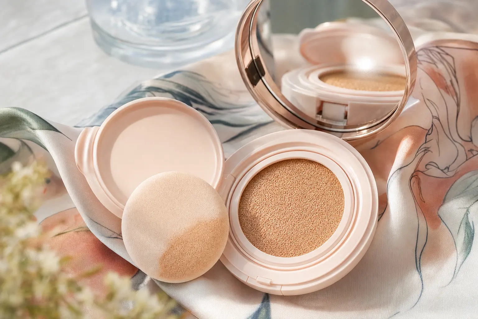
That construction is the reason cushions behave differently from a pump foundation. The liquid is stored in a foam with hundreds of thousands of pores and is transferred to the skin by a puff, so each press delivers a thin, fairly even layer rather than a controlled drop you spread with a brush. A thin layer lets more of your own skin colour show through, which makes the first press look sheerer, brighter and often slightly lighter than the same shade painted on in full. Most cushion formulas are also water-in-silicone or oil-in-water emulsions with a high water fraction, which is why they feel cooling and why the colour shifts as that water evaporates over the first minute or two.
Two practical consequences follow. First, always judge a cushion after it has set, not when it is still wet. Second, compare shades at the same number of presses; a one-press swatch of a deeper shade can look identical to a two-press swatch of a lighter one.
The numbers: what 13, 17, 21, 23 and 25 mean and what they do not
Korean base makeup inherited a numeric depth code from Japanese and Korean department-store systems. In practice, 13 is the palest option, 17 is very fair, 21 is light, 23 is light-medium and 25 or 27 is medium. Lower means lighter. For most of the 2010s the shelf reality was narrow: 21 and 23 dominated, with 17 for very fair skin and little beyond 25. That range described the domestic market of the time, not the limits of the format.
The range has widened sharply. TIRTIR launched its Mask Fit Red Cushion in three shades in 2023 and, after global criticism, expanded through 2024 to a run that on its global site now lists 40 shades, coded from 10C Shell through 21N Ivory and 27N Camel to 45N Saddle Brown and 55N Espresso. The old 17/21/23 trio is therefore the light end of a scale that now runs to 55, and the two-digit number is best read as a depth step rather than a fixed colour.
The number is still only half of a shade code. The letter attached to it identifies undertone: C for cool, N for neutral and W for warm in most Korean systems, with some brands adding pink, rosy, golden or olive descriptors. Two brands can both sell a “21”, one calibrated slightly pink and one slightly yellow, and both can be internally consistent. There is no cross-industry standard that fixes what 21 must look like, so a number is a starting point for a swatch and never a substitute for one.
Depth and undertone are two different measurements
Colour scientists describe skin in the CIELAB space, where L* is lightness from 0 (black) to 100 (white) and b* is the blue-to-yellow axis. The individual typology angle, or ITA, combines those two values into a single angle used to classify skin from very light to very dark; a 2025 paper in Biophotonics Discovery gives the formula as ITA = (180/π) × arctan((L* − 50)/b*) and sets out six bands from very light (50 to 90 degrees) down to very dark. The point for shade matching is that a cushion number is mostly tracking L*, while undertone is tracking the hue direction around the a* (green-to-red) and b* (blue-to-yellow) axes. They are independent. You can have two people with identical depth and opposite undertones, and one number cannot serve both.
Undertone tests you can do without instruments are approximate but useful when combined. Veins that look greenish through the skin suggest warmth, bluish or purplish veins suggest coolness, and an inconclusive result usually means neutral. Jewellery and clothing tests work the same way: gold and warm colours flattering the skin point to warmth, silver and icy colours to coolness. Olive skin is a special case, with a faint green-grey cast that reads yellow in one light and grey in another, and it is the undertone most often mismatched by warm-labelled shades that pull orange.
The jawline swatch resolves what the tests leave open. Skin on the cheek is often redder than the neck, and a match made on the cheek can leave a visible line at the jaw. A shade that disappears where the jaw meets the neck is correct in both depth and undertone.
| Skin signal | Likely undertone | Typical Korean code | Finish that usually flatters |
|---|---|---|---|
| Greenish veins; gold reads better than silver; tans easily | Warm (yellow or golden) | 21W, 23W, 25W | Satin or natural glow; avoid very pink correctors |
| Bluish veins; silver reads better; flushes pink | Cool (pink or rosy) | 13C, 17C, 21C, 23C | Soft dewy or satin; matte can look flat |
| Both metals work; neither warm nor pink foundations look wrong | Neutral | 21N, 23N, 25N | Most finishes; shade choice is mainly depth |
| Yellow-grey cast; warm shades pull orange, pink shades look muddy | Olive | Olive-coded shades where offered; otherwise neutral one step deeper | Satin or light matte; avoid pink-heavy tone-up formulas |
How finish chemistry moves the colour you see
A cushion’s finish comes from the film that remains after water and volatile silicones evaporate. Glow and dewy formulas keep more emollient in that film and often add light-reflecting particles, so they return more specular light to the eye; that reflection reads as brighter and up to half a step lighter than the pigment load alone would suggest. Matte and semi-matte formulas add oil-absorbing powders such as silica or nylon and rely on harder film-formers, so they scatter light diffusely and show the pigment closer to its true depth. Long-wear formulas commonly use silicone resins; a 2022 review in the journal Materials notes that trimethylsiloxysilicate and silsesquioxane resins are used in colour cosmetics precisely because they form a hard, durable film that holds pigment in place.
Those same films explain two everyday complaints. The first is midday darkening, usually called oxidation. Some of it is genuine chemical change in pigment or oils, but much of it is optical: sebum mixing into the film changes its refractive behaviour and the shade looks deeper and warmer. If a cushion reliably darkens on you, choose a shade half a step lighter or slightly cooler, blot before touching up, and set the T-zone lightly. The second is the tone-up effect, where a formula deliberately includes a pale, pink or lavender base to brighten the complexion. Tone-up cushions are meant to lift the skin, not to match it, so they should be judged on the whole face against the neck rather than as a conventional shade match.
Coverage interacts with all of this. Sheer-to-medium cushions are forgiving of a slightly wrong number because your own skin colour does most of the work; full-coverage cushions hide the skin, so the undertone printed on the refill is exactly what you will see. If you like high coverage, be strict about the letter.
The swatch method: exact steps for a counter or a mirror
- Prepare the site. Remove makeup from the jawline and blot any oil. Sunscreen underneath is fine because that is how you will wear the product.
- Load the puff consistently. Press the puff into the cushion twice with moderate pressure. Two presses approximate a light-to-medium everyday layer and give you a repeatable dose across shades.
- Pat, never sweep. Press the puff along the jaw from chin toward ear, then feather the lower edge onto the neck with a fingertip. Sweeping shears the film and gives a streaky, thinner swatch than real wear.
- Wait one to two minutes. Water and volatiles evaporate and the film sets. This is when the true depth and undertone appear.
- Check in daylight. Step to a window or outside. Warm store lighting flatters pink and hides orange; cool LED does the opposite.
- Photograph. Take one photo of a two-press swatch and one of a built-up four-press swatch at neutral exposure, so you can compare candidates later without memory bias.
Online, ask a seller for the same two photographs on a jawline in daylight, plus a shot of the actual refill sponge so you can see the product colour in the reservoir. Retailer swatch grids photographed under studio lights flatten undertone differences and are the least reliable source. User photos help when you filter for people who state their own shade in a system you know, such as “21N in brand X, neutral, medium depth”.
Cushions that illustrate the three finish families
The three products below are current EmpressKorea listings chosen because each represents a distinct approach to finish and shade coding. Treat them as reference points for the categories, not as a universal shortlist; the right cushion is the one whose refill matches your jawline.
TIRTIR’s Mask Fit Red Cushion is the clearest example of a wide, letter-coded range. Its shades run from 10C to 55N and use C, N and W undertone letters, so it is a useful product for learning how depth and undertone are separated in a modern Korean line.
Laneige’s Neo Cushion Matte is a semi-matte, powder-finish formula labelled SPF 46 PA++ and sold as a main compact with a refill. Matte formulas like this show pigment at close to its true depth, which makes them a good benchmark when you are trying to find your number before choosing a finish.
Clio’s Kill Cover Mesh Glow Essential Cushion sits at the glow end, with a mesh-covered cushion that meters the dose and a radiant finish. It is the kind of formula that can read half a step lighter after it sets, so compare it to a matte swatch of the same number before deciding whether you need to go deeper.
For a seasonal view of which formulas hold up in heat and humidity, see our companion piece on Korean cushion foundations for summer, and browse the full face makeup category for refills and minis.
SPF in a cushion: real protection with a dosing problem
Nearly every Korean cushion carries an SPF and PA rating, and the ratings are tested on the formula at the standard application density. The difficulty is the dose. The U.S. Food and Drug Administration advises that an average adult needs about one ounce of sunscreen to cover the body and to reapply at least every two hours, and the American Academy of Dermatology puts the face alone at roughly one teaspoon. A cushion press deposits a small fraction of that amount, so the protection you receive from makeup is real but well below the printed number unless you apply far more product than anyone would for a makeup result.
The practical rule is to treat cushion SPF as a top-up, not a base. Apply a dedicated broad-spectrum sunscreen first, let it set, then use the cushion for colour. During long outdoor exposure, reapply sunscreen on the two-hour schedule; pressing a little more cushion over the top helps refresh the finish and adds some protection without disturbing the base. If you dislike layering, a tinted sunscreen worn as your base is a more honest way to get labelled protection with colour than relying on a cushion alone.
Mixing, correcting and sitting between numbers
Being between two numbers is common because depth steps in Korean systems are coarse. Cushions blend well because they are emulsions, so the cleanest fix is to buy two adjacent refills, tap a little of each onto the back of your hand, and pat both onto the jawline with one puff until the mix disappears. A 70/30 lighter-to-deeper ratio is a sensible first try. If you want the mixed shade permanently, blend the two refills in a clean dish with a spatula and press the mixture into an empty refill sponge; keep the ratio written down for the next batch.
Small undertone corrections are possible without buying another cushion. A pea-sized dab of a peach or warm corrector blended into a cool shade nudges it warmer; a lavender or pink corrector does the reverse. Use very little, because the cushion film is thin and a corrector at the wrong dose shows through it. When the face is lighter than the neck, deepen the perimeter with a bronzing cushion or powder at the temples and along the jaw rather than choosing a deeper overall shade; that keeps the centre of the face luminous while blending the edges. Concealer goes on after the cushion, pressed rather than dragged, so the film underneath is not disturbed.
Hygiene, refills and the life of a compact
A cushion is a wet emulsion touched by a puff every day, which makes hygiene part of shade accuracy: a puff loaded with old sebum and dead skin will darken and streak a swatch. Wash the puff at least weekly with a gentle cleanser until the water runs clear, squeeze it out and dry it flat; replace it every two to three months of daily use. Wipe the compact rim with alcohol when you swap a refill, and keep refills sealed until you need them.
The FDA notes that dipping fingers into a product adds bacteria and fungi, that heat breaks down preservatives and accelerates microbial growth, and that separation, hardening or a change in colour, texture or smell are signs a product should be discarded. Cushions are especially sensitive to heat because their water content is high, so avoid leaving a compact in a car or a sunny bathroom windowsill. A refill that has changed smell or texture will not swatch true and should not be used to judge a shade.
How Korean shoppers use the system, and how to borrow it
Korean consumers treat shade matching as a two-refill habit rather than a single purchase. It is normal to keep one refill for the paler months and one for late summer, to carry a mini for midday pressing, and to mix refills when a brand’s step between numbers is too coarse. Counters demonstrate press-and-pat application and will swatch two undertone lanes at the same depth on request, and online communities share jawline photographs with the shade code and lighting stated. Skin preparation is treated as part of the match: a hydrating essence or serum smooths texture so the thin cushion film sits evenly, and a mattifying primer on the T-zone reduces the midday darkening that oily skin causes.
Outside Korea, the same approach works with online orders. Confirm your undertone lane with the tests above, order a mini or two adjacent refills rather than a full compact, swatch them by the method in this guide, and then commit to the case. Because refills are cheaper than compacts and shade ranges keep widening, the cost of being methodical is small, and the result is a shade that survives daylight, photographs and a full day of wear.
Sources
- Amorepacific: Korea’s Cushion Boom Changes Global Beauty Trends (development history, patents and sales figures)
- Amorepacific Stories: So, what is a Cushion? (format, foam and formula description)
- Epickor: Korean Cushion Shades 17, 21, 23 and the 45-Shade Change
- TIRTIR: Mask Fit Red Cushion shade list and undertone codes
- Biophotonics Discovery (2025): Smartphone tristimulus colorimetry for skin-tone analysis (CIELAB and individual typology angle)
- Materials (2022): Silsesquioxanes in the Cosmetics Industry, applications of silicone resin film formers
- U.S. Food and Drug Administration: Sunscreen, how to help protect your skin from the sun
- American Academy of Dermatology: How to apply sunscreen
- U.S. Food and Drug Administration: Shelf life and expiration dating of cosmetics
Frequently Asked Questions
What does a Korean cushion shade number such as 21 or 23 mean?
The number is a depth marker: lower numbers are lighter. In most Korean lines 13 and 17 are very fair, 21 is light, 23 is light-medium and 25 to 27 medium, with modern ranges continuing to 45 and 55. Each brand calibrates its own numbers, so 21 in one line is not guaranteed to match 21 in another. Read the number together with the undertone letter and confirm with a jawline swatch.
How do I work out my undertone before buying a cushion?
Combine three quick checks. Greenish veins, gold jewellery and warm colours flattering the skin suggest a warm undertone; bluish veins, silver and icy colours suggest cool; mixed results usually mean neutral. Olive skin shows a faint yellow-grey cast and is often mismatched by warm shades that pull orange. Then confirm with a two-press swatch on the jawline, judged after it sets and in daylight, choosing the lane that disappears into the neck.
Can the SPF in a cushion replace my sunscreen?
Not reliably. SPF ratings are measured at a standard application density, and a cushion press deposits far less product than the roughly one teaspoon the American Academy of Dermatology recommends for the face. Apply a dedicated broad-spectrum sunscreen first, let it set, and use the cushion for colour. For long outdoor exposure, reapply sunscreen at least every two hours; a light cushion press on top refreshes the finish and adds a little protection.
Why does my cushion look darker or more orange by the afternoon?
Part of the shift is chemical change in the film and part is optical: sebum mixing into the thin cushion film changes how it reflects light, so the shade reads deeper and warmer. Glow formulas show the effect most on oily skin. Blot before touching up, set the T-zone lightly, and if a formula darkens on you consistently, choose a shade half a step lighter or slightly cooler and press rather than rub when you reapply.
What should I do if I fall between two cushion numbers?
Mix rather than guess. Buy the two adjacent refills, tap a little of each onto the back of your hand, and pat both onto the jawline with one puff, starting with a 70/30 lighter-to-deeper ratio. If the blend works, combine the refills in a clean dish and press the mixture into an empty refill sponge. Choosing the lighter number and deepening the perimeter with a bronzing cushion is the alternative that keeps the centre of the face bright.
How often should I clean the puff and replace a cushion refill?
Wash the puff at least weekly with a gentle cleanser until the water runs clear, dry it flat, and replace it every two to three months of daily use. Wipe the compact rim when you swap a refill and keep new refills sealed. Store the compact away from heat, because high water content makes cushions sensitive to preservative breakdown. Discard any refill that separates, hardens or changes colour, texture or smell; it will no longer swatch true.