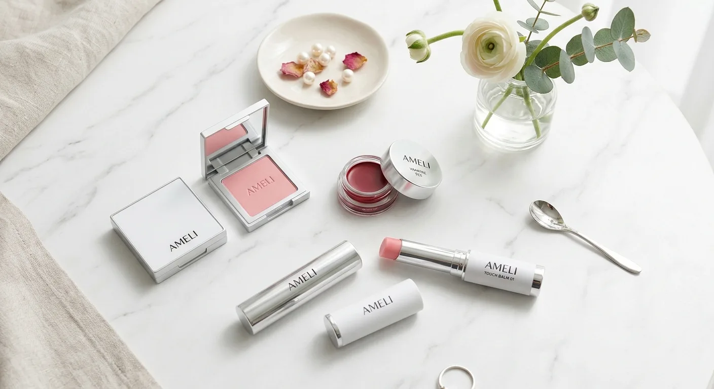
Ameli is one of the few Korean colour brands that grew out of the professional side of the industry rather than out of a skincare house. It began in the mid-1990s as a supplier to Apgujeong salons and makeup-artist students under the company name Cospia, a compound of “cosmetic” and “utopia”, and only later became a consumer brand. That origin explains most of what makes its products distinctive: unusually large eyeshadow pans, a catalogue of several hundred shade formulations that are kept rather than discontinued each season, corrective colours that mainstream brands rarely bother with, and an emphasis on how a colour behaves when layered thinly over skin.
This guide explains the brand’s history and product architecture, the pigment and finish chemistry behind its best-known items, and how Korean personal-colour theory is used to choose and combine them. It also lists the current EmpressKorea listings so that every product mentioned is one you can actually buy.
From salon supplier to colour house: the brand’s history
According to a 2012 profile in the Korean trade paper The BK, Ameli’s founder Kim Ki-sung studied chemistry at Yonsei University and worked in pharmaceuticals before starting Cospia and supplying products directly to salons in Apgujeong, the district that anchors Seoul’s beauty industry. The company opened its own online store on 12 December 2009, had more than 100,000 registered members by 2012, and positioned itself explicitly against the assumption that imported colour brands were better than domestic ones. Allure Korea’s 2021 feature adds the detail that matters most to shoppers: the brand differentiated itself by accumulating more than 300 colour formulations rather than discontinuing shades with each season, and by continually proposing new looks from combinations of existing colours.
The brand’s own site describes the December 2019 relaunch under the company name Ameli Global, with a new symbol and packaging and new categories including a “juxtaposition” line, face cushions and foundation, Air Lips, lip tints and gloss. Distribution has since widened from the brand store and professional channels to mainstream retail, which is why products that were once artist-only, such as the baked powders and shading compacts, are now easy to find.
Longevity is the practical consequence. Allure Korea lists 158 Coral Beige from the Sweet Dia line as a best seller since 2009, 243 Macaron Gray as the shade that made the brand’s name in contouring, 914 Vampire as a deep red that spawned imitations without losing its following, and 172 Wedding Bouquet as the best-selling eyeshadow in the brand’s history. When a colour brand keeps a formulation for fifteen years, the shade you read about is still the shade you can buy.
How the catalogue is organised
The brand’s product map is simpler than the number of shades suggests. Eye colour is split into Step Basic, the workhorse single shadows sold in large pans and built to be layered; Sweet Dia, the pearl and shimmer singles; and Sparkle Spot, moist glitter shadows for the inner corner and the under-eye “aegyo sal” area. Lip colour is split by texture into Plat Lips, the pot-format cream that gives a saturated, slightly glossy finish, and Air Lips, the lighter, blurring version of the same shade families, with separate gloss and tint lines. Face products include foundation, tone-up cushions in several base tints, concealer, the baked powders and the Yeoback Caron shading compact. The Touch Balm series is the multi-use bridge between categories, a single balm stick used on lips, cheeks and lids.
| Category | Ameli line | Format and finish | What it is for |
|---|---|---|---|
| Eye | Step Basic | Pressed powder single, 3.5 to 4 g, matte to satin | Base washes, transitions, soft shading; several shades double as blush or contour |
| Eye | Sweet Dia / Sparkle Spot | Pearl singles; moist glitter | Lid centre, inner corner and under-eye brightening |
| Lip | Plat Lips / Air Lips | Pot cream, saturated; air-light blurring cream | Same shade families in two textures; gradient or full lip |
| Face | Tone-up cushion, foundation, concealer | Cushion with SPF; liquid; cream | Base that matches, or lifts with a pink, lilac or peach cast |
| Face | Baked powder, Yeoback Caron shading | Baked domes; finely milled matte powder | Brightening and setting; vertical mid-face shading |
| Multi-use | Touch Balm | Balm stick with melt-and-set texture | One-product lip, cheek and lid colour |
Pigments, lakes and why finish matters more than colourant
Every colour cosmetic, Korean or otherwise, is built from a short, tightly regulated list of colourants. In the United States the Food and Drug Administration requires that a colour additive be specifically listed for cosmetic use, and it distinguishes between colours exempt from batch certification, which are mostly mineral, such as iron oxides, titanium dioxide and mica, and certified synthetic organic colours, the FD&C and D&C dyes and their lakes, each batch of which must pass FDA analysis before use. A lake, in the agency’s definition, is a straight colour extended on a substrate by adsorption, coprecipitation or chemical combination; lakes are preferred in lipsticks because they do not dissolve in water and therefore do not migrate or stain unevenly. Korean regulation under the Ministry of Food and Drug Safety uses a comparable positive list, and the same restriction applies in both systems: a colour permitted for external use is not automatically permitted around the eyes or on the lips.
Given that shared palette, what makes one brand’s red or grey feel different is formulation. In a pressed shadow the variables are the ratio of pigment to filler, the choice of fillers (talc, mica, synthetic fluorphlogopite, boron nitride, nylon), the binder oils and esters that give slip, and the pressing pressure, which controls how much powder a brush lifts. A “buttery” shadow has enough emollient binder and lamellar filler to glide and to lay down a thin, even film; a chalky one is over-pressed or filler-heavy. Baked powders start as a slurry that is dried on a dome and therefore carry a different filler balance and slightly more emollient than a conventionally pressed powder, which is why they tend to feel creamy and sit lightly on the skin.
Lip textures follow the same logic with different materials. A pot cream such as Plat Lips is a wax-oil matrix with a high pigment load, and its glossiness comes from the residual oils on the surface. A blurring formula such as Air Lips replaces part of that oil with volatile carriers and soft-focus powders, so the film dries down thinner and more diffuse; the shade can be identical, but the lighter film reads softer and reveals more of the lip’s own colour. Long-wear claims across the category depend on film-formers, and a 2022 review in the journal Materials describes silicone resins such as trimethylsiloxysilicate as the standard way to create a durable, transfer-resistant film in colour cosmetics.
Korean personal colour: the framework Ameli’s shades are built around
Ameli’s own site runs a personal-colour content section, and its shade names map onto that system. Korean personal-colour analysis starts from the Western four-season idea but scores three variables rather than one: undertone (warm or cool), depth (light or deep) and chroma (clear or muted). A 2022 imaging-technology thesis from Chulalongkorn University tested colour harmony between skin tones and 128 sample colours and found what practitioners describe: warm undertones harmonised with autumn palettes across all lightness levels, cool undertones split between winter colours at high lightness and summer colours at medium-to-low lightness, and neutral skin harmonised with colours from every season. The same study found that generic colour-harmony models agreed with human observers only about half the time, which is a useful reminder that a personal-colour label is guidance, not a rule.
In practice the system explains why certain Ameli shades became famous. Macaron Gray is a muted, slightly cool taupe-grey that reads as a natural shadow on cool and neutral skin, where a warm brown contour turns orange. Wedding Bouquet is a rose-gold pearl that flatters light, low-chroma “summer” and soft “spring” types. Vampire is a blue-based red, which is why it makes teeth look whiter and suits cool and neutral undertones; a warm-toned version of the same idea leans brick or tomato. When a shade name confuses you, ask three questions in order: is it warm or cool, is it light or deep, and is it clear or muted. Most of the catalogue sorts itself.
Signature products, with the current EmpressKorea listings
Air Lips 814 Vampire is the blurring-texture version of the brand’s best-known red. It builds from a sheer stain to full coverage, and the thin film is what makes a gradient lip easy: press the colour into the centre of the lips with a fingertip and feather the edge outward with the same finger, or use a small brush for a defined edge.
Sweet Dia 172 Wedding Bouquet is the rose-gold pearl single that Allure Korea calls the brand’s best-selling eyeshadow. It is designed to go on the centre of the lid and the inner corner after a matte base, and because the pearl is fine rather than glittery, it works on mature lids where coarse shimmer settles.
Yeoback Caron Shading is the compact that carries the brand’s contour philosophy. The powder is finely milled, low in chroma and neither orange nor grey, and it is meant to be applied vertically, from the temple down the outer cheek toward the jaw in a soft “3” shape, to narrow the mid-face rather than to draw a line under the cheekbone.
The Tone-up Base Daily Cushion in the Dohwa tint is the brand’s SPF 50+ PA+++ base with a soft pink-peach lift. It behaves like a tone-up cushion, which means it should be judged on the whole face against the neck rather than as a conventional shade match; our Korean cushion foundation shade guide explains that distinction and the swatch method.
Building a look: base, point, shading
Professional users of the brand tend to work from three decisions rather than a long routine.
- Base. Match the skin or lift it, but not both. A matched foundation or cushion is the choice when the eyes or lips will carry the colour; a tone-up base is the choice for a bare, brightened face with minimal point colour. Set only where you need it, using a baked powder pressed into the centre of the face with a small brush rather than dusted everywhere.
- Point colour. Pick one: a lip, a lid or a flush. On the eye, lay a Step Basic base shade across the lid, add a single pearl at the centre and inner corner, and stop. On the lips, decide whether the day wants the saturated pot texture or the blurred version of the same shade. A Touch Balm can serve as all three points when the goal is a monochrome face.
- Shading. Apply the shading powder vertically along the outer face with a fluffy brush, then blend inward. Keep it off the centre of the cheek, where it reads as dirt, and away from the nose bridge unless you want a defined nose contour; the same powder works there with a small brush because its matte finish does not add shine.
Tools change the result more than most people expect. A dense, rounded brush presses pigment into place and intensifies it; a fluffy brush diffuses it; a fingertip warms a powder slightly and deposits more, which is why pearl shades look brightest when pressed on with a finger.
Sensitivity, hygiene and expiry
Colour cosmetics are low-risk but not risk-free. The most common reactions come from fragrance, certain preservatives and, rarely, specific colourants, which is why the regulated positive lists exist. Patch-test a new lip or eye colour on the inner arm if you have a history of reactions, and stop using anything that stings or causes redness around the eyes. Pressed powders keep well when they are kept dry and the brushes that touch them are washed; pot lip products and balms carry more risk because fingers introduce bacteria and fungi each time they are used, so apply them with a clean brush or a clean fingertip and discard any product whose smell, texture or colour changes.
For a broader view of how base makeup is chosen in Korea and how cushions and foundations differ, browse the face makeup category, and for the full range of lip textures across brands see the lip makeup category.
Who Ameli suits, and who it does not
Ameli suits people who want to buy singles rather than palettes, who like large pans that last, and who are willing to think about undertone and chroma before shade names. It is also unusually good for cool and neutral skin, because its muted greys and blue-based reds fill a gap that warm-leaning mass brands leave open. It suits less well the shopper who wants a one-palette answer or a lot of packaging; the compacts are plain and the range rewards a little study. Approach it as an artist’s shelf, choose by personal colour and finish, and the catalogue becomes easy to read.
Sources
- Allure Korea (2021): 아멜리? 그 아멜리? (brand history, 300 formulations and signature shades)
- The BK (2012): 아멜리 “전문가 브랜드라 색감도 남다르죠” (founder profile and company origins)
- Ameli official site: product lines and lookbook
- U.S. Food and Drug Administration: Color Additives and Cosmetics fact sheet
- Chulalongkorn University (2022): Personal color analysis based on color harmony for skin tone
- Materials (2022): Silsesquioxanes in the Cosmetics Industry, silicone film formers in colour cosmetics
Frequently Asked Questions
What is Ameli and where does the brand come from?
Ameli is a Korean colour cosmetics brand that began in 1996 under the company name Cospia as a supplier to Apgujeong salons and makeup-artist students. Its founder trained in chemistry and pharmaceuticals, the online store opened in December 2009, and the brand relaunched for consumers in December 2019 as Ameli Global with new packaging, cushions, foundation and Air Lips. It is known for keeping around 300 shade formulations rather than rotating seasonal collections.
What is the difference between Ameli Plat Lips and Air Lips?
They share shade families but differ in texture. Plat Lips is a pot cream with a wax-oil matrix and a high pigment load, giving a saturated, slightly glossy finish. Air Lips replaces part of the oil with volatile carriers and soft-focus powders, so it dries to a thinner, blurred film that shows more of the lip's own colour. Choose Plat Lips for a full, defined lip and Air Lips for a gradient or soft everyday stain.
Which Ameli shades suit cool or neutral undertones?
The brand's reputation rests partly on shades that fill the cool and neutral gap. Step Basic 243 Macaron Gray is a muted taupe-grey that reads as a natural shadow where warm browns turn orange, 914 Vampire is a blue-based red that whitens the teeth on cool and neutral skin, and 172 Wedding Bouquet is a rose-gold pearl for light, low-chroma types. Warm skin generally does better with the coral and beige families such as 158 Coral Beige.
Are Ameli products safe for sensitive skin?
Colour cosmetics are built from regulated positive lists of colourants, and most reactions come from fragrance, certain preservatives or, rarely, a specific pigment rather than from a brand as a whole. Patch-test new lip and eye colours on the inner arm if you react easily, stop using anything that stings near the eyes, and always read the current ingredient list for the exact shade, because filler and binder systems differ between finishes.
How do I apply Ameli shading powder so it looks natural?
Apply Yeoback Caron Shading vertically rather than as a stripe under the cheekbone. Load a fluffy brush lightly, sweep from the temple down the outer cheek toward the jaw in a soft 3 shape, and blend inward, keeping the powder off the centre of the cheek. Because the powder is low in chroma and matte, the same product can define the sides of the nose bridge with a small brush without adding shine.
Can I build a full face with only a few Ameli products?
Yes. Professionals using the brand tend to make three decisions: a base that either matches the skin or lifts it with a tone-up cushion, one point colour on the lips, the lids or the cheeks, and a shading powder placed vertically along the outer face. A Touch Balm can cover all three points for a monochrome look, and a baked powder pressed only into the centre of the face is enough to set the base.