
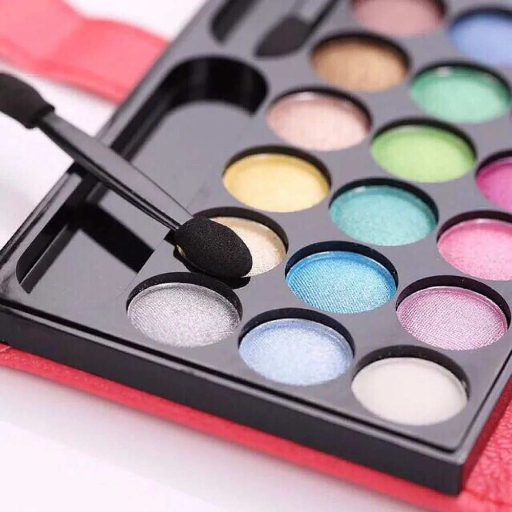
“Use the color wheel, blend well and be confident” is encouragement, not a method. Two products can both be called coral while one is pale and chalky, another deep and translucent, and a third orange under warm light. Successful color makeup depends on more than hue.
This guide turns color into variables you can test: hue, value, saturation, opacity, finish, area and facial contrast. It also treats placement as a design decision rather than a rule tied to ethnicity, gender, age or a seasonal label.
The five controls behind a color look
| Control | Question | Practical adjustment |
|---|---|---|
| Hue | Red, orange, yellow, green, blue or violet? | Move around the color wheel |
| Value | How light or dark? | Add a lighter base or choose a deeper shade |
| Saturation | Muted or vivid? | Sheer out, mix with neutral or choose cleaner pigment |
| Opacity | How much of the skin shows through? | One wash versus layered coverage |
| Finish | Matte, satin, shimmer or glitter? | Change reflection without changing hue |
Area is the sixth practical control. A vivid cobalt line and a full cobalt lid use the same hue but create different visual weight. Start by defining the intended area before deciding that a shade is “too bold.”
Hue: use the wheel as a map
The National Gallery of Art explains that complementary colors sit opposite each other and can make each other appear more intense. Blue and orange, red and green, and yellow and violet are familiar pairs. In makeup, a complement can create contrast around an iris, outfit or accent.
Complementary does not mean compulsory or universally flattering. Product mixtures are not pure artist pigments, skin is not a white canvas and surrounding colors change perception. Treat the wheel as a way to generate options, then test the actual product.
Analogous and monochromatic schemes
Analogous colors are neighbors on the wheel, such as red, magenta and violet. They create lower hue contrast and are useful when you want several colors without a fragmented result. A monochromatic look stays within one hue family while changing value, saturation or finish.
For example, muted rose on eyes, a clearer rose on cheeks and a deep berry lip can feel related without matching exactly. Repeating one undertone or finish is enough to create cohesion.
Value controls visual weight
Light colors tend to advance and widen; dark colors create stronger edges and perceived depth. On the eye, a pale matte can open visual space while a deep liner defines the boundary. On lips, a very pale opaque color can create more contrast than a sheer deep tint.
If a shade looks “wrong,” compare its depth with your features before blaming undertone. The same purple may work as a thin deep liner but look chalky as a pale opaque lid color.
Saturation sets the energy
High saturation reads vivid and graphic. Muted color contains more gray, brown or its complement and usually integrates more quietly. Saturation is not the same as darkness: pastel neon can be light and highly saturated; deep dusty plum can be dark and muted.
Reduce saturation by applying a sheer layer, using a neutral transition shade or choosing a muted formula. Do not muddy a look by repeatedly blending every color together; preserve clean zones and soften only the shared edge.
Your skin and lips are part of the mixture
Sheer makeup combines optically with the surface underneath. A translucent beige gloss over pigmented lips will not look like the tube. Redness, hyperpigmentation, veins and foundation coverage similarly change blush and eye-shadow results.
Swatch on the intended area when safe, not only on the hand. Wait for dry-down, because stains, film formers and oxidation can change color. Screens and brand photographs are useful references but cannot reproduce every display, camera and skin interaction.
Undertone is a description, not a prohibition
Warm, cool, neutral and olive labels describe tendencies in skin and products. They help explain why two nominally pink blushes behave differently, but they do not create a rule that warm skin must avoid blue or cool skin must avoid orange.
When a shade feels disconnected, adjust value, saturation, opacity or placement first. A vivid cool fuchsia may become wearable as a small sheer accent; a muted warm peach may disappear and need more contrast.
Facial contrast explains why placement matters
Research shows that cosmetics can change luminance and color contrast between features and surrounding skin. Eye, eyebrow and lip makeup do not affect the face equally, and more contrast in every region is not automatically preferred.
Decide which feature leads. If the eye is the focal point, keep cheek and lip colors related but quieter. If the lip leads, define lashes or brows enough to balance it without adding a competing full-color lid.
Use a dominant-support-accent ratio
A practical composition has one dominant color area, one supporting family and one small accent. This is more useful than demanding that every product match. A violet eye can lead, muted rose can support on cheeks and a tiny gold inner-corner highlight can accent.
Change the area ratio before buying another shade. Reducing a vivid color from the entire lid to liner often solves the problem while preserving the concept.
Build an eye look from structure outward
- Place a matte or satin base close to the skin value if needed.
- Map the main hue within the visible lid or chosen shape.
- Add depth only where it supports the shape.
- Blend the border with a clean tool, not endless circles over the whole lid.
- Place shimmer or glitter last and only where intended.
- Check with eyes open, closed and looking down.
Fallout can be removed with a clean brush or tape used cautiously away from irritated skin. Applying eye makeup before base makeup is another option for loose pigments.
Colored liner is the lowest-commitment experiment
A slim pencil can put color at the lash line, outer corner or lower-lash accent without covering the lid. Deep navy, plum, green and burgundy can replace black while retaining definition. Pale shades can highlight but may show texture or transfer more visibly.
Map the line in short strokes and keep the pencil sharpened or retracted as directed. Do not use a face or lip pencil in the waterline unless the exact product is labeled for that eye-area use.
Blush placement changes the color’s effect
The same blush looks different high and outward, centered on the apples, across the nose or low on the cheek. Placement changes the perceived distribution, while saturation and finish control prominence. Start with a small brush load and build both cheeks in alternating passes.
Judge blush after lips are added; lip contrast can make the cheek suddenly look weaker or stronger. If a color turns ashy, a deeper or more translucent version may integrate better than simply adding more pale powder.
Lip color has three separate decisions
Choose boundary, opacity and finish independently. A blurred edge feels softer; a precise edge increases graphic contrast. A tint lets natural lip color participate; opaque lipstick replaces it. Gloss adds reflection and can visually spread the color beyond the sharp pigment boundary.
For multi-use lip-and-cheek products, follow the label and use clean tools. Avoid moving a used lip applicator directly onto cheeks or sharing the pot.
Texture can compete with color
Matte emphasizes shape and pigment; shimmer responds to light; chunky glitter creates discrete points. Strong texture plus strong hue plus large area can be intentional, but it increases visual complexity. When a look feels crowded, simplify one of those controls.
Glitter adhesion and removal need planning. Use a compatible base, avoid loose particles near the eye unless intended for that use, and lift residue gently rather than rubbing.
Blend edges, not identities
Good blending creates a controlled transition. It does not mean making every shade indistinguishable. Use one brush to place color, another to soften the edge and a clean tool to correct. Wipe excess pigment between zones.
Powder over tacky cream can grip unevenly. Either set a thin base first or work in small sections. If colors become muddy, stop adding pigment, clean the boundary and rebuild one zone.
Light changes the answer
Warm bulbs can mute blue and intensify orange; cool light changes how warmth and redness are perceived. Direct flash increases reflective texture, while diffuse daylight softens it. Test the finished look in daylight, normal indoor light and the camera you will use.
Do not choose foundation or color products only under a retailer spotlight. Take a photo without a beauty filter and allow time for the product to dry.
Wear testing needs a small protocol
Record product, shade, primer, application amount, setting method, hours, temperature and activities. Check fading, creasing, transfer, staining and irritation at fixed times. This makes comparisons more useful than “lasted all day.”
Test one new variable per wear. A new primer, palette, eyeliner and remover used together make it difficult to identify what improved wear or caused a reaction.
Eye-area color safety is non-negotiable
FDA advises using products intended for the eye area, keeping hands and tools clean, not sharing cosmetics and stopping immediately with irritation. Color additives have approved uses; a pigment permitted for external facial makeup may not be permitted near the eye.
Do not add water or saliva to dried mascara or liner. Avoid application in a moving vehicle and discard products used during an eye infection. Persistent pain, swelling, discharge or vision change needs medical attention.
Acne-prone skin can use color makeup
AAD recommends looking for oil-free, non-comedogenic or “won’t clog pores” labeling, removing makeup before bed and cleaning brushes weekly. These steps reduce common risks but do not guarantee individual tolerance.
If bumps appear, consider product placement: cheek and forehead makeup may be relevant even when eye makeup is not. Stop the suspected product and avoid covering new irritation with additional layers.
Tool hygiene protects the experiment
Wash brushes with appropriate cleanser, rinse completely and dry them in a way that prevents water from sitting inside the ferrule. Keep cream and pot products free from repeated dirty-finger contact by using a clean spatula or applicator.
FDA notes that cosmetics degrade through air, light, heat, moisture and repeated microbial exposure. Discard products that change odor, texture or color unexpectedly and follow period-after-opening guidance where provided.
Four current formats to practice with
The products below illustrate a coordinated eye palette, buildable powder blush, multi-use cream color and slim colored liner. Verify the exact shade menu and intended areas on each live listing; one product card can represent several options that are not interchangeable.
A ten-minute color exercise
- Pick one focal feature and one hue family.
- Choose a light wash, medium anchor and small deep accent.
- Apply only half the expected intensity.
- Add the rest of the face before increasing color.
- Photograph in two lights.
- Change only area, saturation or value on the next attempt.
This produces reusable knowledge about your products. “Confidence” becomes the result of a repeatable process, not a requirement to tolerate a look that does not meet your goal.
The practical verdict
Color makeup is not mastered by memorizing one complementary pair or buying a neutral base. It is controlled through hue, value, saturation, opacity, finish and area. Facial contrast and the underlying skin or lip color make each result specific.
Start with one dominant feature, build slowly, preserve clean edges and test in real light. Safety limits remain fixed even when creativity is open: intended-use labeling, clean tools, no sharing and complete removal.
Sources
- National Gallery of Art: The element of color
- Cosmetics and facial contrast
- Regional contrast changes with cosmetic use
- American Academy of Dermatology: acne and makeup
- FDA: Eye cosmetic safety
- FDA: Color additive safety
- FDA: Cosmetic shelf life and expiration
Frequently Asked Questions
What are the most important variables in color makeup?
Separate hue, value, saturation, opacity, finish and application area. A hue name alone cannot predict how vivid, light, sheer or reflective the result will be.
Do complementary colors always look best together?
No. Opposites on a color wheel create contrast, but the actual result also depends on product mixture, skin or lip color, value, saturation, area and lighting.
How can I make a bold color easier to wear?
Reduce its area or opacity before changing the hue. Try it as a thin liner, small accent or sheer wash, then balance the rest of the face.
Can I use a lip or face pigment around the eyes?
Only if the exact product is labeled for eye-area use. Color additives and contamination controls differ by intended area, so “multi-use” should be confirmed on the package.
Why does a makeup shade look different from its online photo?
Your underlying color, product opacity, dry-down, lighting, camera processing and display calibration all affect the result. Swatch safely on the intended area and check in real light.